
You open your store analytics and the numbers look fine at first. Visitors are landing on your best product. And yet when you scroll down to sales, almost nobody is buying.
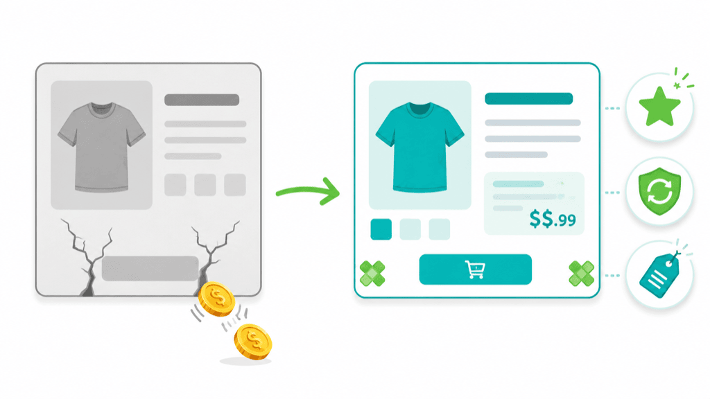
It’s easy to read that as a traffic problem and start looking for more visitors, more ads, and more posts. But before you spend more money bringing people in, look at the page itself. You may have a leak, and every visitor who hesitates and clicks away is a visit you already worked or paid to earn.
The good news is that leaks are usually small, obvious once you know where to look, and free to seal. In the next ten minutes, you’ll identify the biggest leaks on your product page and choose the first free fix to make today.
By the end of this post you’ll have:
- A seven-point score for your highest-traffic product page
- A shortlist of the leaks most likely costing you sales
- One free improvement you can make today
- A simple before-and-after measurement plan so you know whether it worked
The 10-Minute Leaky Page Audit
Open your best-selling product page (or the one with the most traffic) on your phone, because a page that works beautifully on desktop can still be frustrating on a phone. Then walk the seven checks below in order, top of the page to the buy button.
The audit takes about ten minutes. Fixing everything does not, and I won’t pretend otherwise, because finding good reviews, taking a real photo, and adjusting your theme all take time. So think of it like this: ten minutes to find the leak, then one focused hour to fix the most important one. You don’t need to do all seven today. You need to find the worst one and start there.
The seven checks follow the same path your buyer’s eye takes down the page: understand it, picture it, price it, trust it, reduce the risk, then take action.
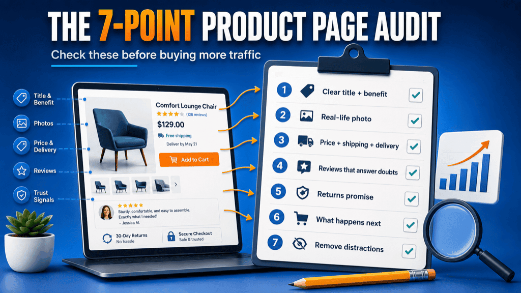
Fix 1: Make It Obvious What the Product Does
Your product title still needs to say exactly what the thing is, because that’s what buyers scan for and it’s what search engines read. Don’t replace a clear title with a vague benefit line.
Instead, keep the title and add one benefit-led sentence directly beneath it. For example:
- Cooling Bamboo Pillowcase
- Stay cooler through the night without flipping your pillow every ten minutes.
The name tells them what it is. The line underneath gives the buyer the reason to care. Most product pages only do the first half.
Fix 2: Add One Photo That Shows It in Real Life
You don’t need to throw out your clean studio shots. This is about adding one image, not swapping anything out. A single photo that shows the product in the real world does more for believability than another angle on a white background.
Good options for that one photo:
- The product being held or worn
- The product shown at its true scale
- The product sitting in an ordinary home, not a showroom
- The product next to a familiar object for size
- A photo a genuine customer actually sent you
This matters even if you already shoot your own polished images. Even polished original photos can feel distant. A more natural image helps shoppers picture the product in their own lives and understand what they are buying.
Fix 3: Show the Price, Shipping Cost and Delivery Time
Baymard found that 39% of shoppers who abandoned checkout did so because additional costs, including shipping, taxes and fees, were too high. That surprise often lands at checkout, after the shopper has already decided they want the product.
So don’t make people reach checkout to find out what this will really cost. Put the likely shipping cost and the delivery window right there on the product page. If shipping is free over a certain amount, say so near the price. If it usually arrives in three to five days, say that too. When people can see the full cost and timing up front, they can make the decision with less uncertainty.
Fix 4: Feature Three Reviews That Answer Real Doubts
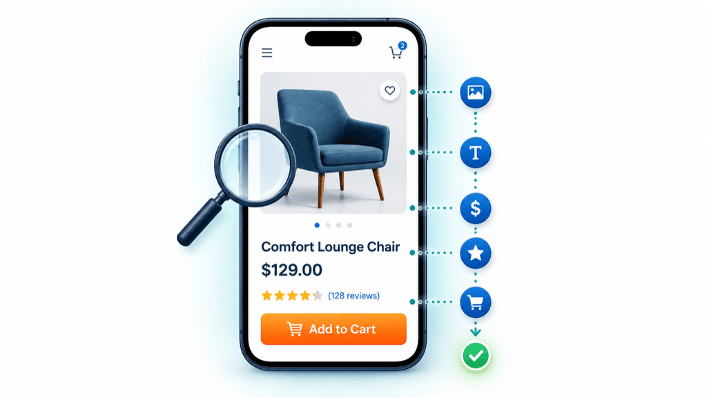
Most stores treat reviews as a pile of stars. The goal becomes collecting more of them, rather than using them to answer the questions blocking the sale. But a shopper on the fence isn’t counting reviews, they’re looking for answers to three specific questions:
- Will it work for someone like me?
- Is it worth the price?
- What might I be worried about before I order?
Find genuine reviews that answer each question and feature them near the top, or pull a short excerpt into the product description. Preserve the customer’s meaning and follow your platform’s rules. The aim is to surface the useful reviews, not rewrite them.
Fix 5: Put Your Returns Promise Beside the Buy Button
A generous return policy buried in the footer cannot reassure someone who never scrolls down to see it. Put it near the button, where the customer is making the decision.
Returns and guarantees aren’t always the same thing, so cover whichever you have. You might not offer a formal product guarantee, but if your policy genuinely allows it, a plain “30-day returns, no questions asked” can be just as reassuring. Say it in plain words, right next to the button.
Fix 6: Make the Buying Area Explain “What Happens Next”
You don’t need a clever button. “Add to Cart” is instantly understood, and getting creative with it usually adds confusion, not clarity. The fix isn’t the button, it’s the reassurance around it.
Keep the familiar label, then add a short, calm line or two nearby. Use only the details that genuinely apply to your store:
- Secure checkout
- Ships within two working days
- Free returns within 30 days
- Review your order before payment
- Taxes calculated at checkout
That quiet reassurance removes uncertainty at the point where the shopper has to make a decision.
Fix 7: Remove the Biggest Distraction Before the Button
The first six fixes were about adding the right things. This one is about taking one thing away, and it’s often the highest-impact move on the whole page. Look at everything between your main image and the buy button and find the biggest distraction: a popup, a wall of text, a countdown widget, an unrelated upsell.
Use this rule: between the main image and the buy button, every element should help the shopper understand the product, trust the seller, or complete the purchase. Anything else is a candidate for removal, so if it isn’t helping, test the page without it.
Do the Math, and Change One Thing at a Time
Let’s ground the promise honestly. Say your page converts at 1.5% on 1,000 visitors a month. That’s 15 sales. If a combination of changes lifted that rate to 2.2%, you’d reach 22 sales, which is 7 more a month on traffic you already have, with no extra ad spend. The point isn’t that every store will see that exact increase. It’s that even a small improvement can produce more sales from the same traffic.
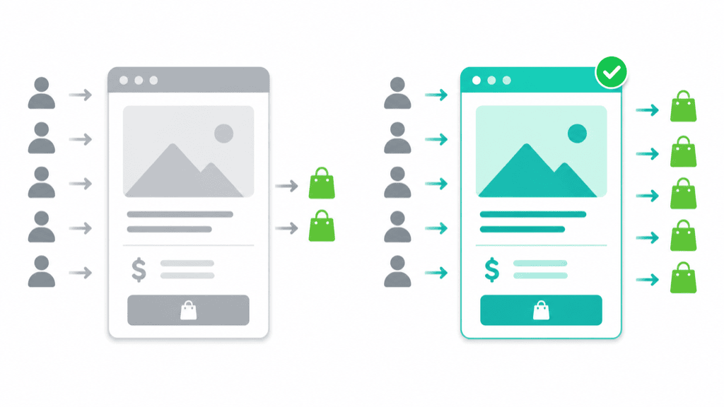
One important thing: don’t change all seven at once, unless the page is clearly broken. If you flip everything on the same day, you’ll never know which fix actually worked. Instead:
- Record your current conversion rate.
- Make the single most important change.
- Give it enough traffic or time to mean something.
- Avoid drawing conclusions from a handful of visits or one unusually good day.
- Record the result.
- Move to the next leak.
If you’re a lower-traffic store, a formal split test isn’t realistic, and that’s fine. You can still watch the directional signals: your add-to-cart rate, how many people start checkout, the questions customers ask you, and where they drop off. Those can still show whether the page is moving in the right direction.
What These Leaks Look Like in Different Stores
These aren’t case studies with measured results. They’re common product-page patterns, so see which one sounds most like your store.
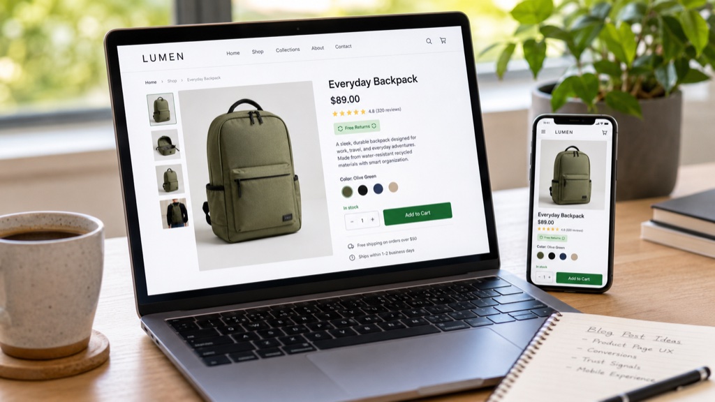
The homeware store. Beautiful photography and a lovely brand, but the shipping cost and returns policy are both buried in the footer. The buyer likes the product but can’t tell what delivery will cost, so they leave to “think about it.” Fixes 3 and 5 close that gap.
The one-product store. The whole page leans on supplier images, with no real-life photo and a couple of generic reviews. It looks like every other store selling the same item, so the page gives the shopper little reason to trust it. Fixes 2 and 4 make it feel real.
The print-on-demand seller. A cluttered page, a vague title, and three widgets competing with the buy button. The visitor can’t tell at a glance what makes this product worth choosing. Fixes 1 and 7 clear the path.
Why This Matters
Getting more traffic costs time or money. Improving a product page is different, because the work keeps benefiting future visitors.
That’s why this audit is worth doing before you launch another ad or start another promotion. Spend ten minutes finding the biggest problem, then focus on fixing that one first.
Your 5-Minute Quick Win
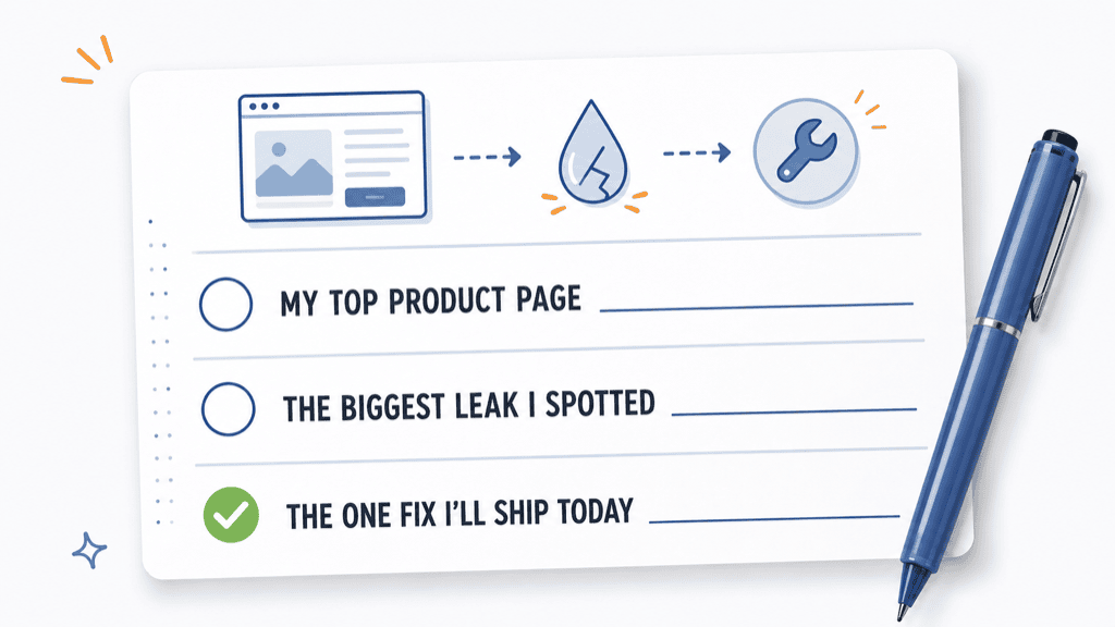
Before you close this tab, open a note and fill in these three lines. It takes about a minute and it turns reading into doing:
- My top product page is: ___
- The biggest leak I spotted: ___
- The one fix I’ll ship today: ___
That’s it. One page, one leak, one fix. Start there.
“But What If…”
“What if my traffic is just too low to tell whether anything changed?”
At low volume, conversion rate can swing too much to be useful. Watch add-to-cart rate, checkout starts, and repeated customer questions instead, and avoid judging the result from a handful of visits.
“What if my product page is on Amazon or Etsy and I can’t change everything?”
You can’t control the whole layout, that’s true, but you control more than you think. Your title, your first image and image order, your description and product details, and your shipping settings where the platform allows are all areas you can usually influence. You influence future reviews indirectly through the quality of your product and service. Fix what’s in your hands.
“What if I already have reviews and photos?”
The question isn’t whether they exist. It’s whether they answer the buyer’s most important questions quickly enough. Ten generic five-star reviews do less than three that handle a real objection, and a dozen studio shots do less than one photo that looks like the buyer’s own home.
More traffic feels like the answer because it’s the thing everyone talks about. But pouring more visitors into a leaky page just loses money faster. Fix the page first, and the traffic you attract afterwards has a better chance of converting.
You already did the work to bring them to the page. Make sure the page does its part.

